Contemporary
Wall Art Trends 2026: What's Actually Worth Hanging
· 3 min read
A grounded look at where wall art is heading in 2026 — the shifts worth acting on, tied to work you can actually buy, and the fads not worth your wall.
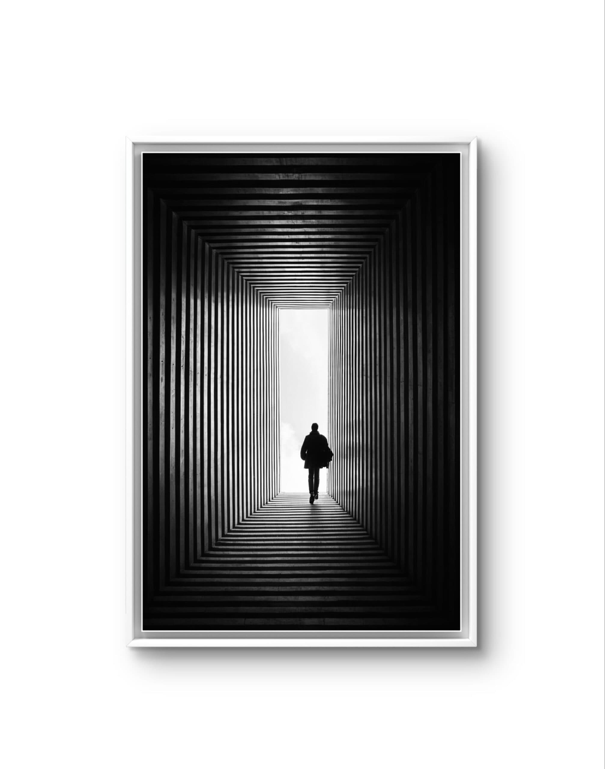
Most "trend" lists age badly because they chase whatever looked new last season. The useful question isn't what's suddenly fashionable — it's which shifts are durable enough to still look right in five years. For 2026, the movement across interiors is toward warmth, restraint and authenticity: fewer mass-produced posters, more art that feels considered and personal. Here is what that means for a wall, with pieces you can act on today.
1. Quiet over loud: monochrome and negative space
After years of maximalism, rooms are calming down. The strongest 2026 walls lean on minimalist compositions and black-and-white photography — a single subject, generous space around it, a narrow palette. In a busy home, a quiet piece reads as more sophisticated than anything shouting for attention. Monochrome also has the practical advantage of sitting comfortably with almost any existing colour scheme.
2. Warm abstraction replaces cool grey
The cool-grey era is fading. Warmer, earthier palettes — terracotta, ochre, muted clay and sand — are defining 2026 interiors, and abstract work is where that reads most clearly. Abstract prints in warm tones add mood without a subject to date them, which is exactly why abstraction stays relevant while literal trends come and go.
3. One big piece instead of a crowded gallery wall
The densely packed gallery wall is giving way to the confident single statement: one large, well-chosen piece with room to breathe. A statement print above a sofa or bed anchors a room more calmly than a dozen small frames competing for attention. Gallery walls aren't gone — but the 2026 version is looser and more restrained. If you're building one, our guide to building a contemporary art wall covers spacing and scale.
4. Nature and the "bringing the outside in" mood
The pull toward calm, natural imagery continues. Landscape and nature prints — wide horizons, forest, coast, close studies of leaf and water — bring stillness into rooms that spend all day around screens. It's less a passing trend than a steady correction toward what actually helps a space feel restful.
5. Authenticity: signed originals over mass-produced posters
The clearest shift of all is away from anonymous, drop-shipped prints and toward art with a person behind it. Buyers increasingly want to know who made the piece and hold something signed rather than churned out at scale. Every ArtMarket print is hand-signed by the artist, produced on premium photographic paper, and shipped unframed and rolled so you frame it your way. Browsing by artist is the point, not a footnote.
What to ignore
Skip anything that only works as a photograph of a styled showroom — hyper-specific colour fads, novelty typography, and "sets" designed to be bought all at once. The pieces people keep are the ones they reacted to, not the ones that matched a seasonal mood board. Buy for the wall you actually have, and for a piece you'll still notice next year.
See where the gallery sits against these shifts: start with minimalist or abstract work, or browse the full catalogue of signed prints from €40.
Frequently asked questions
- What are the biggest wall art trends for 2026?
- A move toward calm and restraint: monochrome and minimalist compositions, warm earthy abstraction replacing cool grey, one large statement piece instead of a crowded gallery wall, natural landscape imagery, and a clear preference for signed originals over mass-produced posters.
- Are gallery walls still in style in 2026?
- Yes, but looser. The densely packed grid is giving way to a single confident piece with space around it, or a more restrained, uncrowded arrangement. If you build a gallery wall, keep spacing consistent and let the works breathe.
- What colours are trending for wall art in 2026?
- Warm, earthy tones — terracotta, ochre, clay and sand — are replacing the cool greys of recent years. Abstract prints carry these palettes well, adding warmth and mood without a literal subject that dates quickly.
- How do I follow trends without my walls looking dated in a year?
- Favour durable shifts over novelty. Monochrome, warm abstraction and natural subjects age well; hyper-specific colour fads and novelty typography don't. Buy pieces you genuinely react to rather than ones that match a seasonal mood board.