Photography
C-Type vs Giclée vs Archival: Print Processes Compared
By Alexander van der Meer·· 6 min read
Three processes, three different objects. What actually separates a C-type from a giclée from an archival pigment print — chemistry, colour, longevity and cost.
Three terms come up constantly when buying photographic prints, and sellers use them loosely enough that they can seem interchangeable. They are not. Each names a different way of getting an image onto paper, and the differences show up in colour, in surface, in how long the print survives and in what it costs.
This is a comparison rather than a recommendation. If what you want is a straight answer on which to buy for a given image, our giclée or photographic print guide takes that question head-on. What follows is what is actually happening in each process.
The three processes at a glance
| C-type | Giclée | Archival pigment | |
|---|---|---|---|
| Method | Light exposed onto photographic paper, developed in chemistry | Inkjet, typically dye or pigment, onto fine-art paper | Inkjet, pigment only, onto acid-free cotton or photo rag |
| Surface | Smooth, gloss to matt, continuous tone | Depends entirely on paper — often textured | Usually matt or lightly textured cotton |
| Colour | Very smooth gradients, slightly narrower gamut | Wide gamut, saturated | Wide gamut, more restrained and neutral |
| Longevity | Decades, but fades faster than pigment | Varies hugely — dye is the weak link | The longest of the three |
| Cost | Moderate, needs a lab | Low to moderate | Highest |
C-type: the chemical one
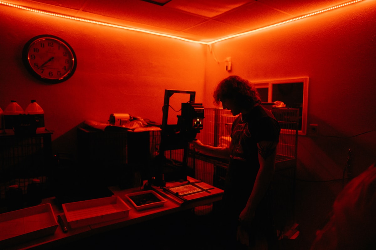
A C-type — chromogenic print — is the only one of the three that is a photograph in the traditional sense. Light is projected onto light-sensitive paper and the paper is developed in chemistry, exactly as a darkroom print always was, except that the light source is now usually a digital laser or LED exposure unit rather than an enlarger.
The consequence is continuous tone. There are no dots. Colour is formed in emulsion layers within the paper rather than laid on top of it, which gives gradients a particular smoothness — skies, skin, fog and shadow transitions have no structure in them at all under a loupe.
The trade-offs are real. The paper choice is narrow, because it must be light-sensitive: you get gloss, lustre or matt photographic paper, and nothing textured. And chromogenic dyes are less stable than pigment, so a C-type will outlast most things but not an archival pigment print.
Best for
Images that live in their gradients — atmospheric landscape, fog and mist, skin tones, anything where a smooth transition is the whole point.
Giclée: the loosest term of the three
"Giclée" was coined in 1991 to make inkjet printing sound respectable to the art market, and it worked rather too well. It has no technical definition and no standards body behind it. Strictly it means a high-resolution inkjet print on fine-art paper; in practice it means whatever the seller wants it to mean.
That is not a reason to dismiss it. A good giclée is an excellent object: inkjet can lay down more distinct colours than chromogenic chemistry can, so a giclée typically has a wider gamut than a C-type, and because the paper does not need to be light-sensitive you can print on almost anything — heavy cotton rag, textured watercolour paper, canvas.
The catch is the ink. If a giclée is printed with dye-based inks, it can shift visibly within a few years. If it is printed with pigment inks, it is an archival pigment print and would be better described as one. So the useful question when someone offers you a giclée is always: which inks, and on what paper? A seller who cannot answer is telling you something.
Best for
Work that wants saturation or surface texture — bold abstract, painterly and mixed-media work, anything where the tooth of the paper is part of the effect.
Archival pigment: the durable one
An archival pigment print is inkjet again, but with the two variables pinned down. The inks are pigment — solid particles suspended in carrier, rather than dyes dissolved in it — and the paper is acid-free, usually cotton rag or a photo rag.
Pigment particles are far more stable than dye molecules under light, which is why this process is rated in decades of display rather than years, and why it is what museums and serious galleries specify. It also sits slightly more neutral and restrained than a dye giclée: less immediate punch, more tonal separation in the shadows.
The costs are money and vividness. Pigment inksets and cotton papers are expensive, and a pigment print on matt cotton will never look as glossy-bright as a saturated dye print on coated stock. That flatness is a feature to most people who buy prints and a disappointment to some.
Best for
Anything you intend to keep. Particularly monochrome work, where pigment's shadow separation is most visible.
How to read a listing
Sellers rarely lie about this, but they very often omit. Three questions resolve almost every ambiguity:
- Pigment or dye? The single most important question, and the one that decides longevity. "Archival" without "pigment" is a marketing word.
- What paper? A named paper means somebody chose it. "Premium paper" with no further detail usually means it came with the printer.
- Who printed it? A photographer who prints their own work, or specifies a lab, is making decisions. A drop-shipped listing is not.
Every work in this gallery is produced on premium photographic paper and hand-signed by the artist who made it, in an edition of 25, with a certificate naming your number in the run.
Which should you actually buy?
For most buyers, most of the time: match the process to the image rather than to a ranking. A misty landscape wants the continuous tone of a C-type or a fine pigment print. A high-saturation abstract wants the gamut and texture options of a giclée. Something you intend to still own in thirty years wants pigment, regardless of subject.
And the honest caveat: all three, well made, look excellent on a wall. Process matters far more for how the print ages than for how it looks the day it arrives.
Frequently asked questions
- What is the difference between a C-type and a giclée print?
- A C-type is a true photographic print — light exposed onto light-sensitive paper and developed in chemistry, giving continuous tone with no dot structure. A giclée is a high-resolution inkjet print on fine-art paper, which allows a wider colour gamut and far more paper choices, including textured stock.
- Is giclée better than archival pigment?
- They overlap. “Giclée” has no technical definition and covers both dye and pigment inkjet; “archival pigment” specifies pigment inks on acid-free paper. A pigment giclée is an archival pigment print. A dye giclée is not, and will not last as long.
- Which print process lasts the longest?
- Archival pigment. Pigment particles are far more stable under light than dissolved dyes, so pigment prints on acid-free cotton are rated in decades of display. C-types last a long time but fade faster; dye-based inkjet is the weakest of the three.
- Does a C-type print look different from an inkjet print?
- Under close inspection, yes. A C-type forms colour in emulsion layers within the paper, so gradients have no dot structure at all — noticeably smooth in skies, fog and skin tones. Inkjet lays ink on the surface, which allows texture and saturation a C-type cannot reach.
- What does giclée actually mean?
- It was coined in 1991 as a more saleable name for high-resolution inkjet printing on fine-art paper, and it has no standards body behind it. Treat it as a starting point rather than a specification, and ask which inks and which paper.
- Which process is best for black-and-white photography?
- Archival pigment, usually. Monochrome depends entirely on tonal separation in the shadows, which is where pigment inks on a matt cotton paper perform best. A well-made C-type is an excellent alternative if you want a smoother, more traditional photographic surface.