Photography
Art for Japandi Interiors
By Alexander van der Meer·· 5 min read
Japandi shares Scandinavian discipline but not its temperature. What that changes about the art — and the one arrangement that reliably ruins the room.
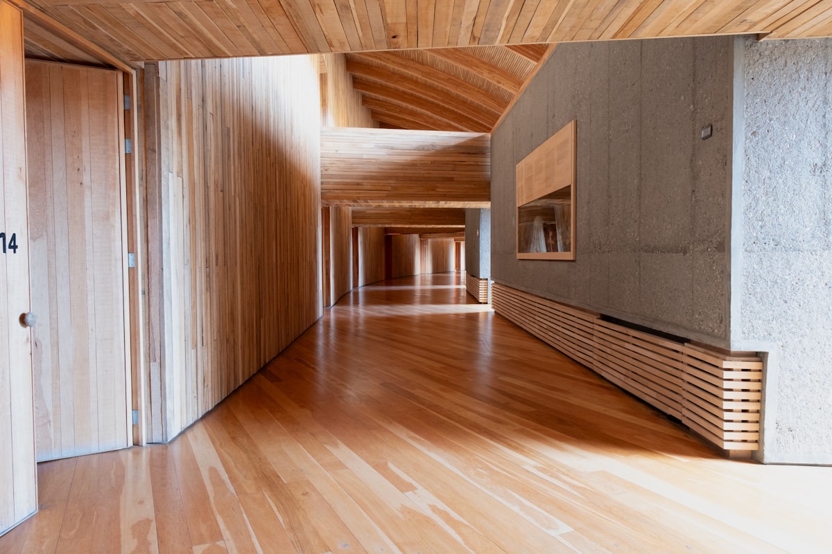
Japandi is often described as a blend of Japanese and Scandinavian design, which is accurate and not very useful. The practical question is what it borrows from each, because they pull art in different directions.
From Scandinavian design it takes the discipline: few objects, natural materials, nothing decorative for its own sake. From Japanese design it takes wabi-sabi — a preference for the weathered, the asymmetric and the incomplete — and, crucially, a warm palette.
That last point is where most Japandi art choices go wrong.
Warm, not cool
Scandinavian rooms run cool and bright: chalk white, grey-blue, pale ash. Japandi rooms run warm and low: clay, unbleached linen, aged oak and walnut, muted greens and browns, black used as an accent rather than a base.
So art that suits one will not automatically suit the other, even though the two styles look similar in photographs. A stark high-contrast monochrome print — perfect in a Scandinavian room — can read as cold and slightly clinical against clay and linen. Warm-toned work, which fights a Scandinavian palette, settles here immediately.
If you are choosing between the two directions, our companion piece on art for Scandinavian interiors covers the cool side.
One subject, and space around it
This is the defining principle and the one worth getting right.
Wabi-sabi values patient observation of a single thing over the skilful arrangement of many. In practice that means the images that suit a Japandi room share a structure: one subject, held off-centre, with a large quiet area doing apparently nothing. A heron standing still in a river. Two swans on flat water. A single footprint dissolving under an incoming wave. A view framed by a window.
That empty area is not wasted space — in this tradition it is the composition. Which has a useful practical consequence: a Japandi room can take a large print without feeling crowded, provided the subject occupies a small fraction of it. Scale the piece to the wall as you normally would, then choose an image whose subject is small within the frame. A busy image at the same size will make the room feel smaller rather than larger.
The Japandi edit gathers the gallery's work built this way.
Subjects that belong
- Birds and branches. The most directly Japanese motif and the most reliable — a heron on a branch, storks by still water, a bird in flight against empty sky.
- Water at rest. Ponds, slow rivers, reflections. Moving water is dramatic; still water is contemplative, and the style wants the second.
- A framed view. Landscape seen through a window or doorway. The framing device echoes shoji screens and is entirely native to the style.
- Traces rather than events. A footprint, a path, light on a floor. Wabi-sabi is interested in what has passed as much as in what is present.
The one arrangement to avoid
The gallery wall. A grid of six or nine frames is the single most reliable way to lose a Japandi room.
The style is built on one considered object with space around it. A cluster reads as accumulation — the opposite instinct — and no amount of careful spacing or matching frames fixes it, because the problem is the number of things, not their arrangement.
Hang one piece per wall. If you want a second, put it on a different wall, ideally one you see from a different position in the room.
Framing
Warm woods in matt finishes: oak, ash, walnut. Or plain black with a wide off-white mat, which is the more Japanese of the two options and works particularly well with monochrome.
Avoid cool greys and stark bright whites — they belong to the Scandinavian version of this palette and will sit a shade apart from the clay and linen tones around them. Avoid gloss entirely; the style is built on matt, tactile surfaces and a shiny frame is conspicuous.
An unframed print, clipped or mounted on a simple wooden hanger, is also entirely legitimate here in a way it is not in most styles — the informality reads as intentional.
Getting the height right
Japandi furniture sits low, like Scandinavian furniture, so the same adjustment applies: centre the piece around 145 cm rather than 152 cm, or 25–30 cm above the back of whatever sits beneath it. Our hanging guide has the full measurements.
Every print in the gallery is a limited edition of 25, hand-signed by the artist and shipped unframed and rolled, from €65.
Frequently asked questions
- What art suits a Japandi interior?
- Images with one subject and generous empty space around it — a heron on a branch, still water, a view framed by a window, a trace like a footprint in sand. Warm and muted rather than cool and high-contrast, matching the clay, linen and aged-wood palette of the style.
- What is the difference between Japandi and Scandinavian art choices?
- Temperature. Both styles share the same discipline — few objects, natural materials, nothing purely decorative — but Scandinavian runs cool and bright while Japandi runs warm and low. A stark monochrome print that suits a Scandinavian room can read as clinical against clay and linen.
- Can I hang a large print in a Japandi room?
- Yes, provided the subject occupies a small fraction of the frame. The empty area is part of the composition in this tradition, so a large print of one small subject opens the room up. A busy image at the same size will make it feel smaller.
- Does a gallery wall work in a Japandi interior?
- No — it is the most reliable way to lose the style. Japandi is built on one considered object with space around it, and a cluster of frames reads as accumulation. Hang one piece per wall, and put any second piece where you see it from a different position.
- What frame suits Japandi style?
- Warm woods in matt finishes — oak, ash or walnut — or plain black with a wide off-white mat. Avoid cool greys, stark bright whites and any gloss finish. An unframed print clipped or hung from a simple wooden hanger also suits the style.
- What is wabi-sabi in the context of choosing art?
- A preference for the weathered, asymmetric and incomplete over the polished and symmetrical. In practice it means choosing an image of one thing observed patiently rather than many things arranged well, and valuing traces of what has passed as much as what is present.