Black & white
Art for Scandinavian Interiors
By Alexander van der Meer·· 5 min read
Scandinavian rooms invert the usual advice: the risk is not hanging something too small, it is hanging something too loud. What actually works, and why.
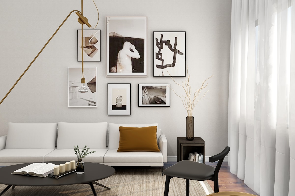
Scandinavian interiors are unusually unforgiving of art, and for a reason that is easy to miss. The style is defined by subtraction — pale walls, a narrow palette, honest materials, and a lot of empty surface for northern light to move across. A room with that little visual noise in it has no capacity to absorb a loud picture.
Which inverts the standard advice. In most rooms the common mistake is hanging something too small. Here, the common mistake is hanging something too much: a saturated, busy or high-contrast print that undoes the whole scheme in one move.
Why warm-toned art fights the room
Scandinavian palettes sit cool: chalk white, grey-blue, pale ash and birch, occasionally a muted sage. Warm-toned work has nothing in the room to agree with it.
The effect is subtle and persistent. A golden-hour landscape that looks beautiful in isolation reads slightly orange and slightly wrong against a cool white wall, because there is no other warm element for the eye to relate it to. In a Mediterranean or Japandi room, full of clay and timber and linen, that same print settles instantly.
This is why so much art that suits the style is monochrome. Take colour off the table and the conflict cannot arise.
If you do want colour
Stay on the cool side of the wheel — grey-blue, slate, muted green — and keep it to one piece. A single cool-toned work in an otherwise monochrome room reads as deliberate. Three of them read as a scheme that never quite committed.
Scale, and the low-furniture problem
Scandinavian furniture is characteristically low: low sofas, low sideboards, low bed frames. That changes where art belongs.
The gallery-standard centre height of 152 cm assumes furniture of ordinary height and a viewer standing. In a room of low furniture, art hung at 152 cm floats — it has nothing to attach to visually, and reads as decoration applied to a wall rather than as part of the room. Drop the centre to about 145 cm, or measure 25–30 cm above the back of the sofa, and the piece belongs to the seating instead.
Width follows the usual rule: two-thirds to three-quarters of the furniture beneath. Our guide to hanging heights covers the measurements in more detail.
What to hang
Three things that consistently work in this style.
- Monochrome landscape. Snow, mist, bare trees, water under grey light. The subject matter is native to the region and the tonal range matches the walls.
- Minimal line work. A single figure or form in a few black lines on white. This is the most Scandinavian thing you can hang and the easiest to get wrong — it needs real negative space around it, both inside the frame and on the wall.
- Spare architecture. A lone house in an open field, a single structure against sky. Isolation as a composition rather than as a subject.
Our Scandinavian edit gathers the gallery's work in this register, and the broader minimalist collection overlaps it if you want a wider field to choose from.
Framing
Light oak, natural ash, or a slim matt black. That is essentially the whole list.
Avoid gold, ornate mouldings, and anything with a gloss finish. In a room this sparse the frame becomes a feature whether or not you intended it to — and a decorative frame will be the single loudest object in the space, competing with a print that was chosen for restraint.
Use a wide mat, 6–8 cm at the sides and a little more at the bottom. In a pale room the mat is not padding: it extends the wall's white into the frame and makes the image read as deliberately placed rather than as filling the available area.
Two things to avoid
The full gallery wall. A grid of nine frames is a maximalist move in a minimalist room. If you want more than one piece, hang two well apart on different walls rather than clustering them.
Matching the wood. A birch frame against a birch floor against a birch sideboard reads as a showroom rather than a home. Let one element differ — a black frame in a room of pale wood is far more effective than a fourth shade of the same timber.
Prints in the gallery are hand-signed, produced on premium photographic paper, and ship unframed and rolled so the frame decision stays yours. From €65, with free EU delivery over €175.
Frequently asked questions
- What art works in a Scandinavian interior?
- Monochrome landscape, minimal line work and spare architectural compositions. The style's cool palette and empty surfaces mean the risk is hanging something too loud rather than too small — restraint, limited tonal range and a single clear subject all work in your favour.
- Why does warm-toned art look wrong in a Scandinavian room?
- Because nothing else in the room is warm. Scandinavian palettes sit cool — chalk white, grey-blue, pale ash — so a golden-hour image reads slightly orange against them, with no other warm element for the eye to relate it to. The same print settles instantly in a Japandi or Mediterranean room.
- How high should I hang art in a Scandinavian room?
- Lower than the gallery standard. Scandinavian furniture is characteristically low, so a centre height of 152 cm leaves art floating with nothing to attach to. Drop the centre to about 145 cm, or measure 25–30 cm above the back of the sofa.
- What frame suits Scandinavian style?
- Light oak, natural ash or a slim matt black, with a wide mat of 6–8 cm. Avoid gold, ornate mouldings and gloss finishes — in a room this sparse a decorative frame becomes the loudest object in the space and competes with a print chosen for restraint.
- Can I have a gallery wall in a Scandinavian interior?
- It works against the style. A grid of frames is a maximalist gesture in a room built on subtraction. If you want more than one piece, hang two well apart on different walls rather than clustering them into a single dense arrangement.
- Should the frame match my wooden floor?
- Better not to. A birch frame against a birch floor and a birch sideboard reads as a showroom. Let one element differ — a black frame in a room of pale wood is more effective than adding a fourth shade of the same timber.