Photography
How to Choose the Right Art Print for Your Home
· 5 min read
How to choose an art print that actually suits your space — sizing it to the wall, reading the light in the room, and picking a mood you will still love in five years.
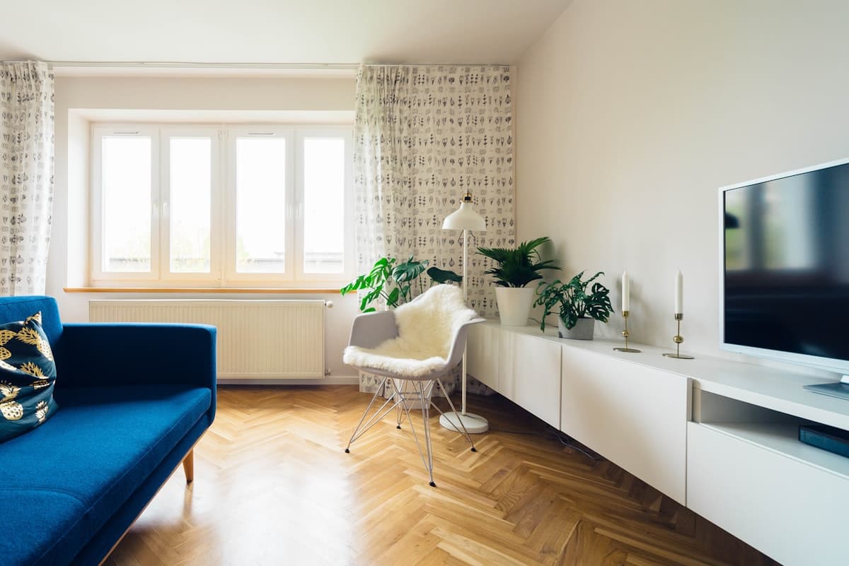
Choosing art for your home should feel exciting, not intimidating. The best print is the one you keep noticing — the piece that quietly changes how a room feels every time you walk in. The problem is that most people start in the wrong place: they browse thousands of images, fall for something on a screen, and only then work out where it goes.
Flip the order. Start with the wall, then the mood, then the image. This guide walks through that sequence, with the measurements and rules of thumb interior designers actually use.
Start with the wall, not the artwork
Measure the wall before you browse anything. Width, height, and the width of whatever furniture sits beneath it. Almost every "this print looks wrong here" problem is a scale problem, not a taste problem.
The two-thirds rule
Art hung above furniture should span roughly two-thirds to three-quarters of the width of that furniture. Above a 200 cm sofa, that means art occupying about 130–150 cm — either one large piece or a group whose combined width lands in that range. Anything much narrower reads as an afterthought floating in space.
Match the print to the wall's job
- Large empty wall (over 200 cm wide): one statement piece, or a symmetrical pair. Going small here creates visual clutter.
- Above a sofa or bed: a single horizontal piece, or three verticals hung as a set.
- Hallway or stairwell: a run of smaller prints — you view them close and in sequence, so detail matters more than scale.
- Alcove, shelf, or desk: smaller works you can lean rather than hang.
If you are unsure about dimensions, our art print size guide covers standard sizes in centimetres and which one suits each wall.
Decide what you want the room to feel like
Every print sets a temperature. Before you look at images, decide whether this room should feel calm, energised, focused, or intimate — then let that decision filter the options.
Calm and quiet
Monochrome, minimalist compositions and wide landscapes lower the visual volume of a room. A black-and-white photograph brings structure and stillness — which is why it works so well in bedrooms, where you want the wall to settle rather than shout.
Energy and colour
If the room is already neutral — grey sofa, white walls, pale floor — a bold piece is doing the decorating. Mixed-media work layers paint, collage and digital technique into images that hold attention from across the room. One is usually enough.
Focus
For a study or home office, choose something with depth but not drama — architecture, abstract structure, quiet landscape. You want a piece that rewards a glance, not one that competes for your attention all day.
Let colour do the work
You have two honest options: blend or contrast. Both work; picking neither is what goes wrong.
To blend, pull a colour already present in the room — a cushion, a rug, the wood tone of the floor — and choose a print where that colour appears somewhere in the image. The piece will look like it was always meant to be there.
To contrast, choose a print that deliberately breaks the palette: a warm, saturated work against cool grey walls, or a stark monochrome against a colourful room. Contrast makes the art read as intentional — as a choice rather than a coordinate.
What rarely works is the near-miss: a print that is almost the same colour as the wall behind it. Either commit to harmony or commit to tension.
Check the light before you commit
Light changes an image more than most people expect. A north-facing room with cool, even light flatters monochrome and muted palettes. A south-facing room with strong direct sun will wash out subtle mid-tones — high-contrast images hold up far better there.
Direct sunlight is also the main enemy of a print's lifespan. If the only available wall gets hard afternoon sun, plan for UV-protective glazing when you frame it. Our framing and care guide covers the specifics.
Buy the piece, not the trend
Trends in interior imagery move fast. The pieces people keep are the ones they had a reaction to — not the ones that matched a mood board.
A practical test: look at the print, close the tab, and come back the next day. If you are still thinking about it, that is the one. Every ArtMarket print is hand-signed by the artist and produced on premium photographic paper, shipped unframed in a protective tube so you can frame it exactly as your room needs. Prices start at €40, so a first piece does not have to be a leap.
Browse the full collection, explore work by artist, or start with a curated set like living room art or art under €60.
Frequently asked questions
- What size art print should I buy for my living room?
- Measure the furniture the art will hang above and aim for a piece — or a group — spanning about two-thirds of that width. Above a 200 cm sofa, that means roughly 130–150 cm of artwork. For a large empty wall, one big piece reads better than several small ones.
- How do I choose art that matches my interior?
- Decide first whether you want the print to blend or contrast. To blend, pick up a colour already in the room. To contrast, choose a piece that deliberately breaks the palette. The one thing to avoid is a near-match to your wall colour, which reads as accidental.
- Should I choose colour or black-and-white art?
- Black-and-white works when you want a room to feel calm and structured, and it sits comfortably with almost any palette. Colour works when the room is neutral and needs a focal point. Rooms you rest in usually suit monochrome; rooms you gather in take colour well.
- Do ArtMarket prints come framed?
- No. Prints ship unframed and rolled in a protective tube, so you can choose framing that suits your space. This also keeps the print safe in transit and lets you fit it to a standard or custom frame.