Litvin
Fractured Momentum: The Art of Chaos
€145
Signed fine-art prints — shipped across Europe & to the USA, free EU delivery over €175
Cool palette
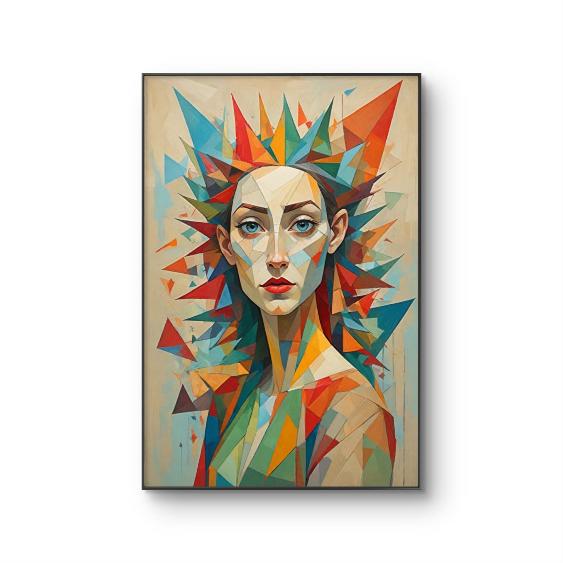
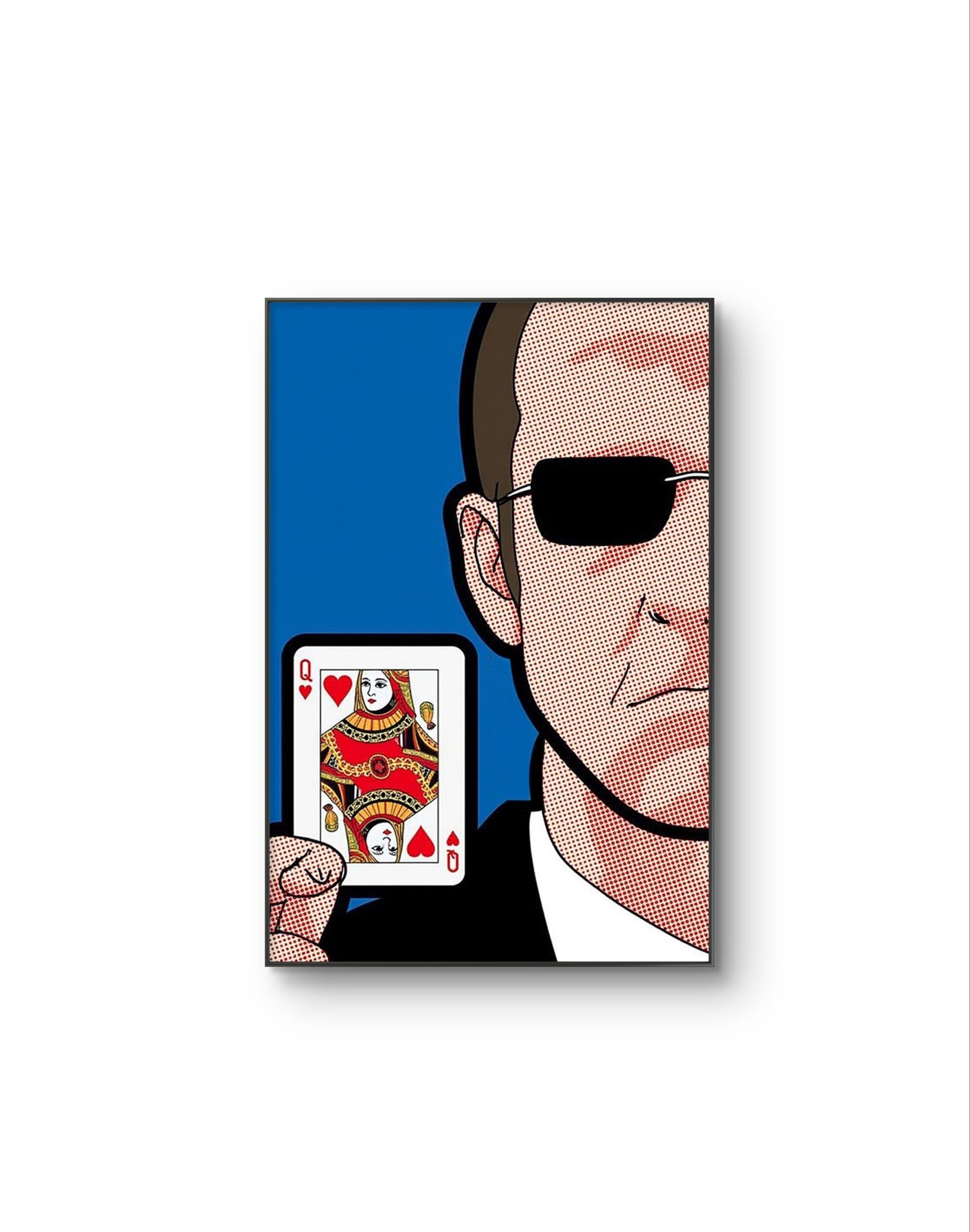
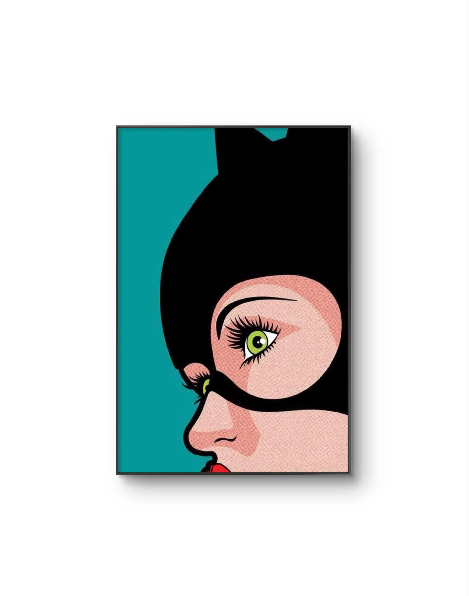
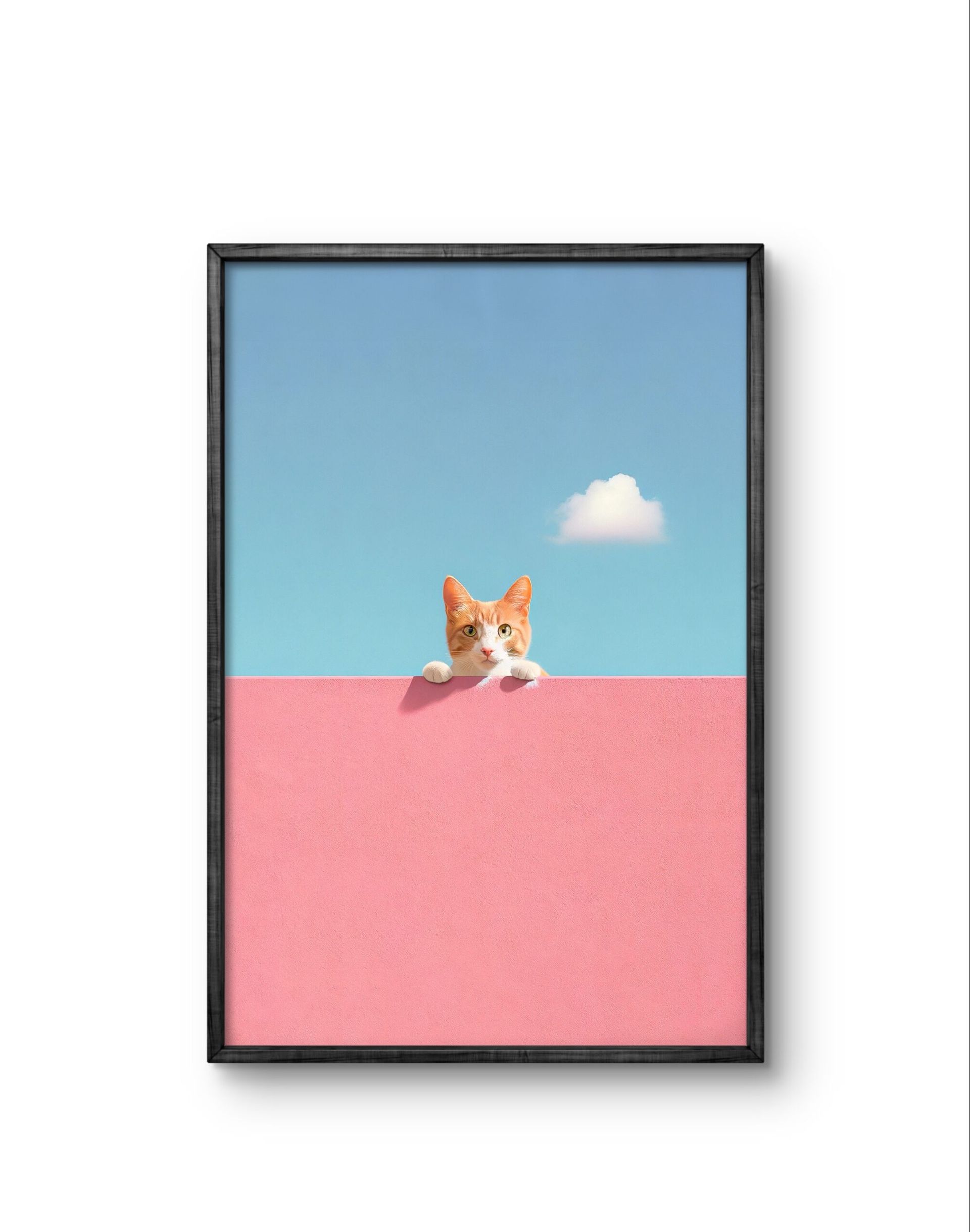
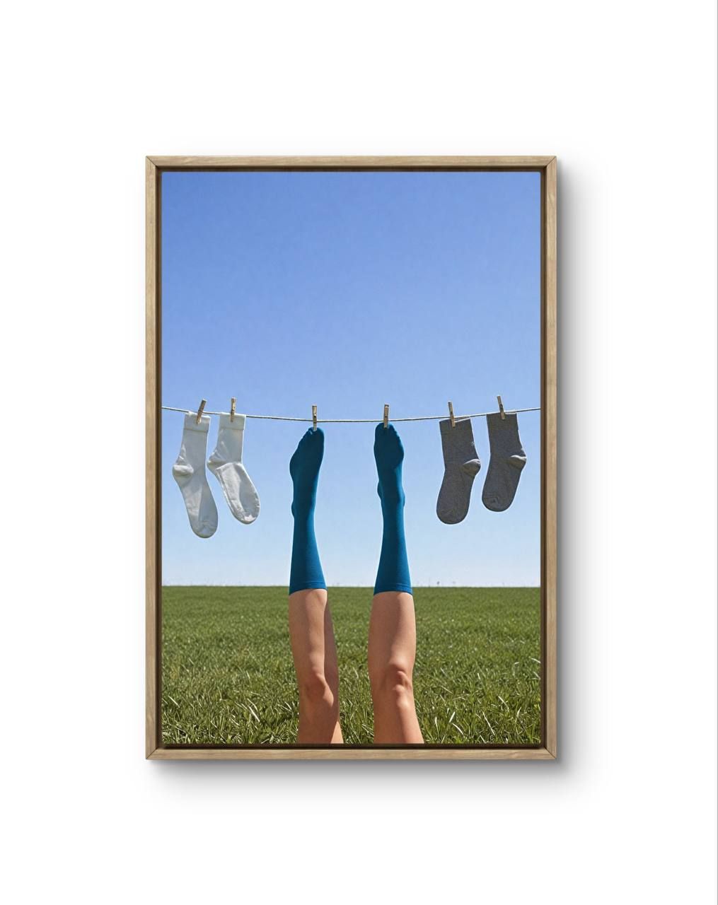
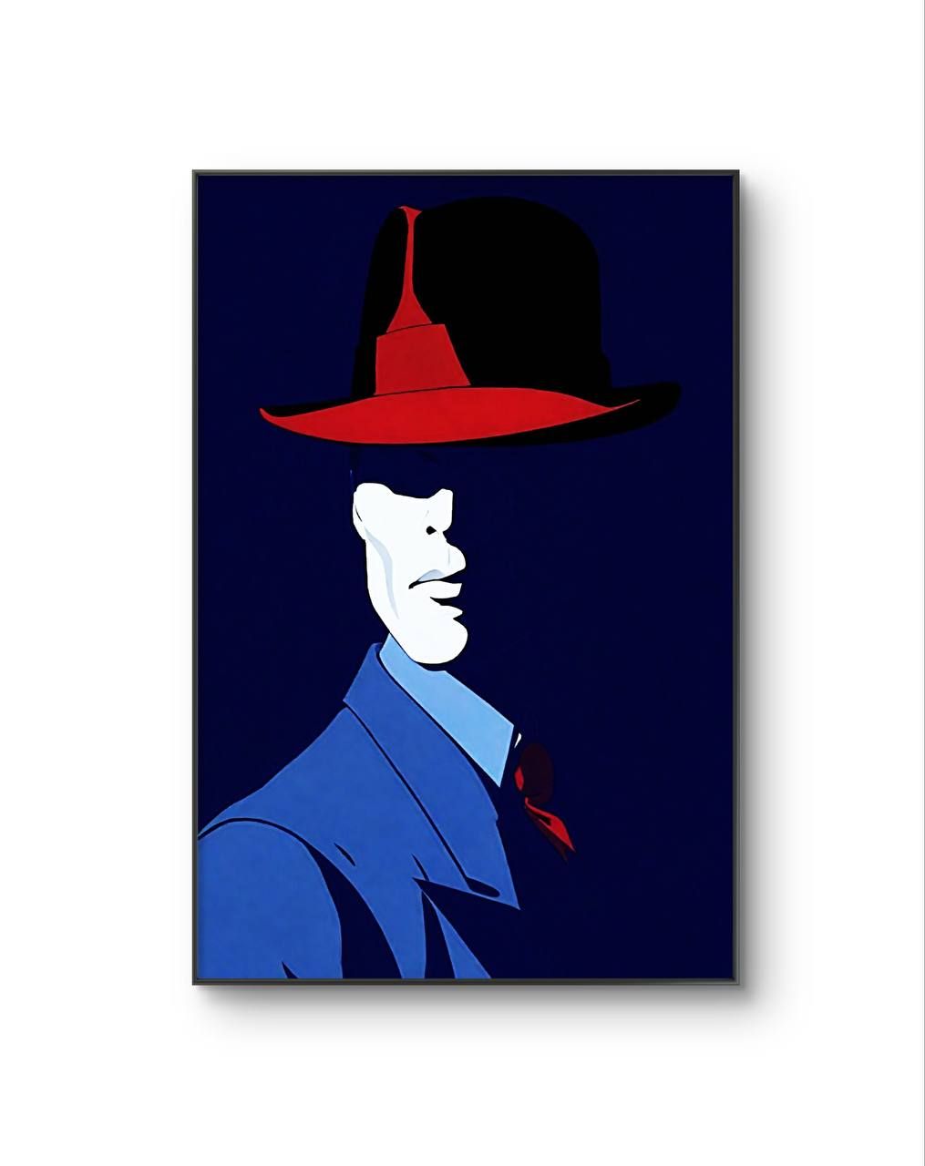
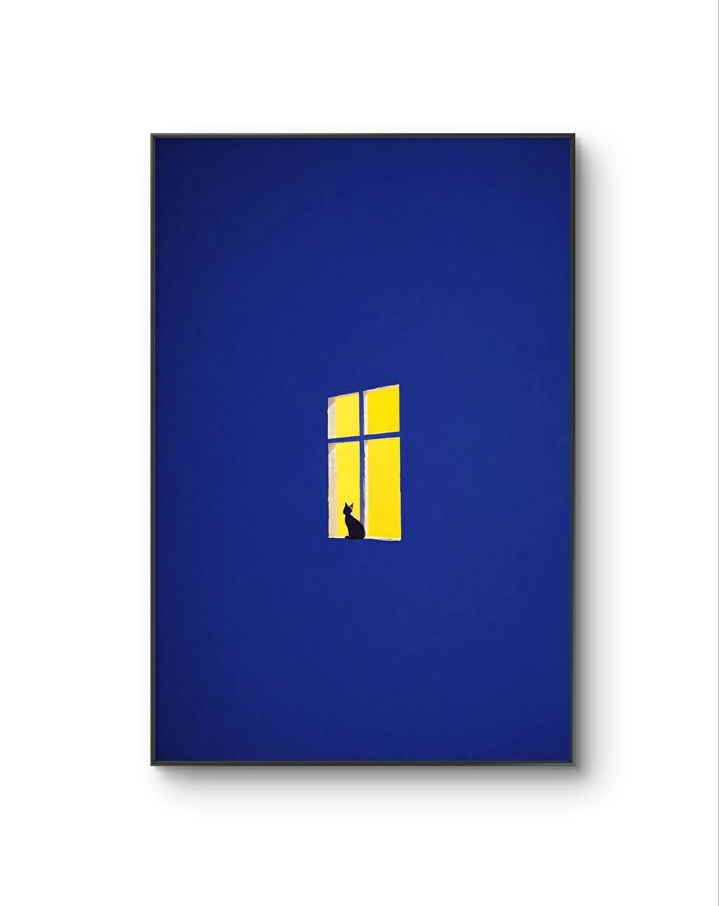
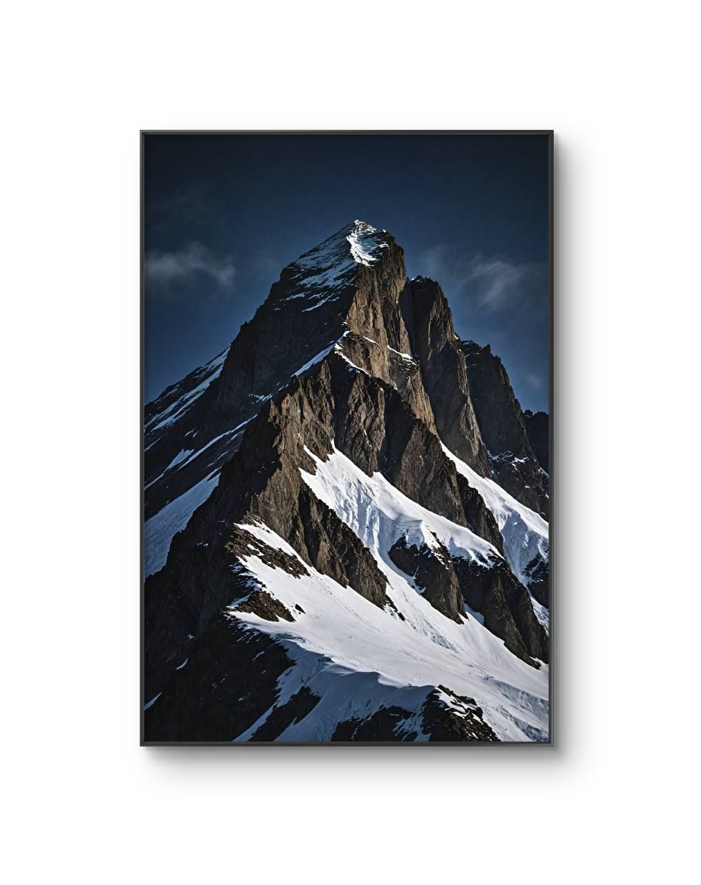
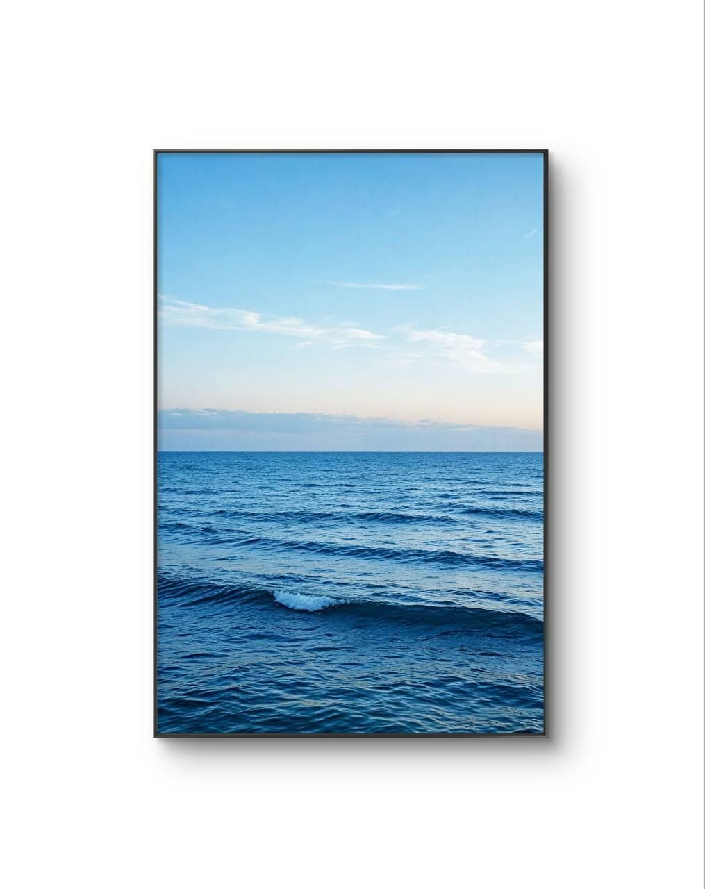
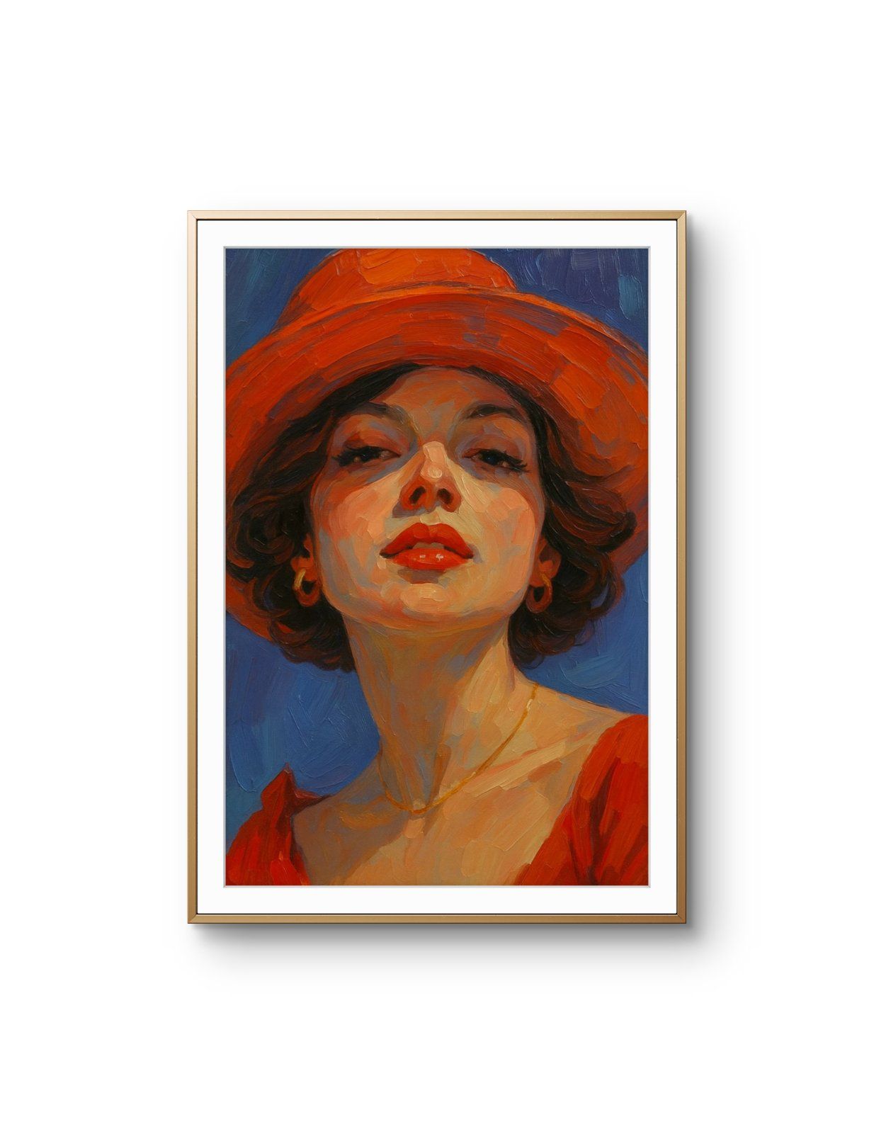
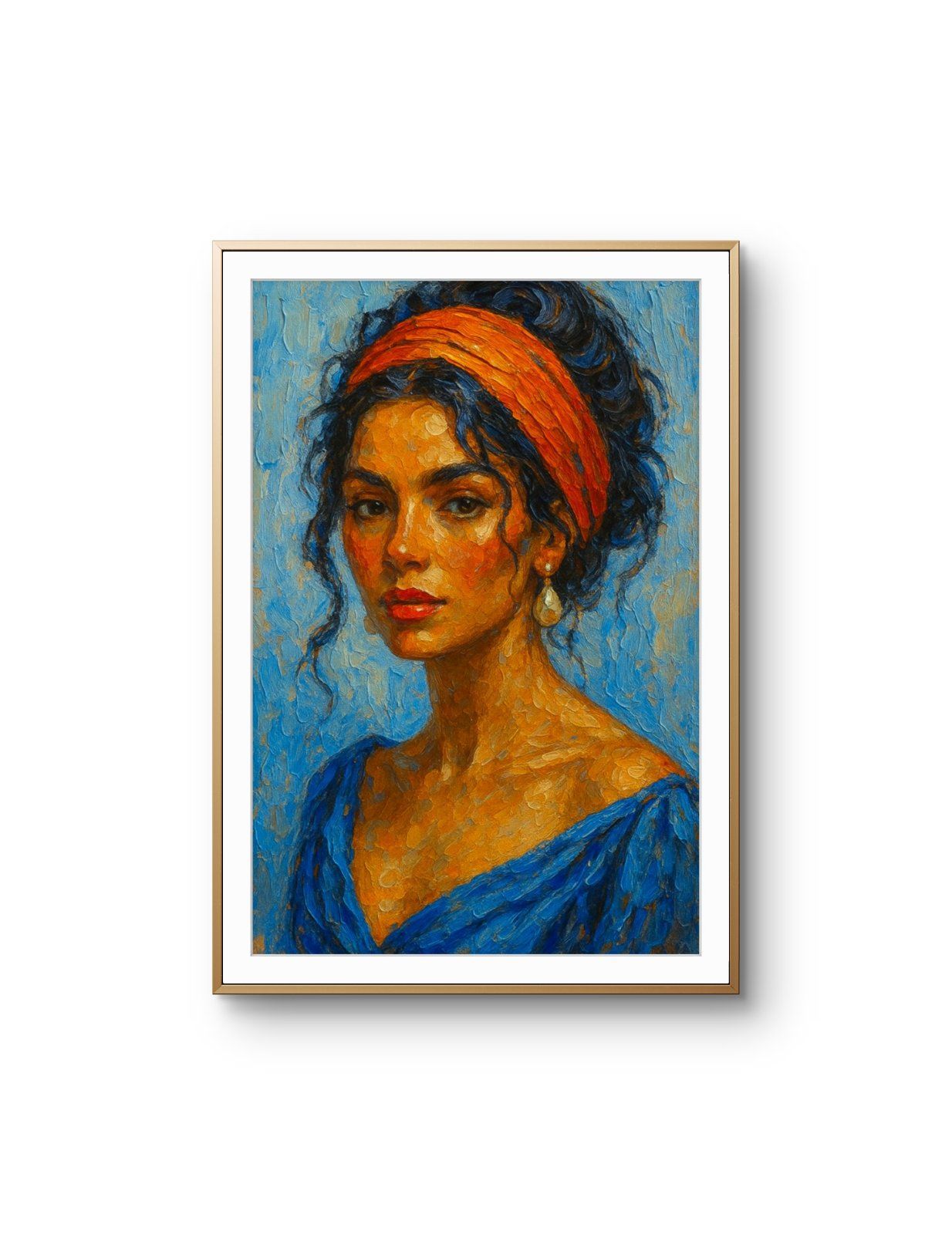
Blue is the one colour that reliably recedes. A blue-dominant print pushes a wall back rather than pulling it forward, which is why it settles a small room instead of crowding it, and why it sits so easily against wood, stone and white paint.
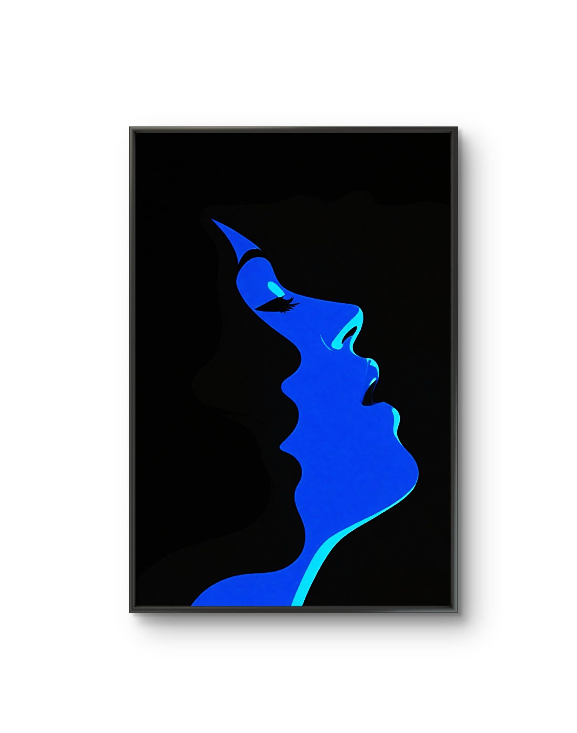
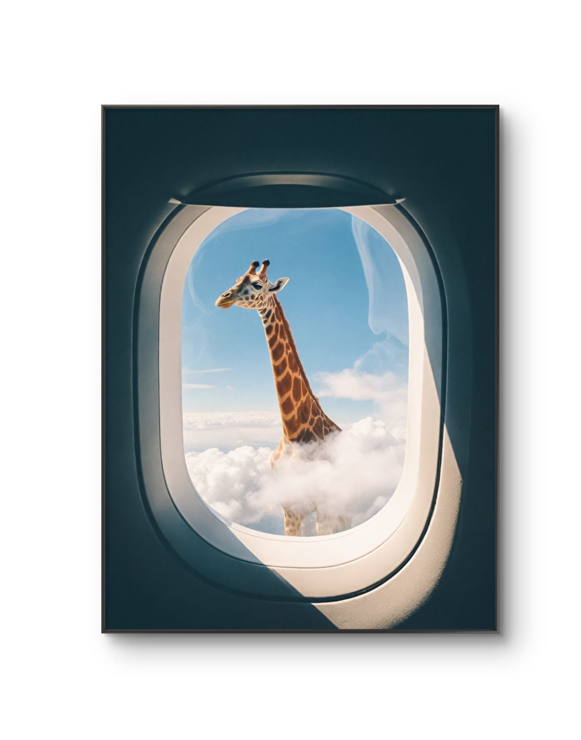
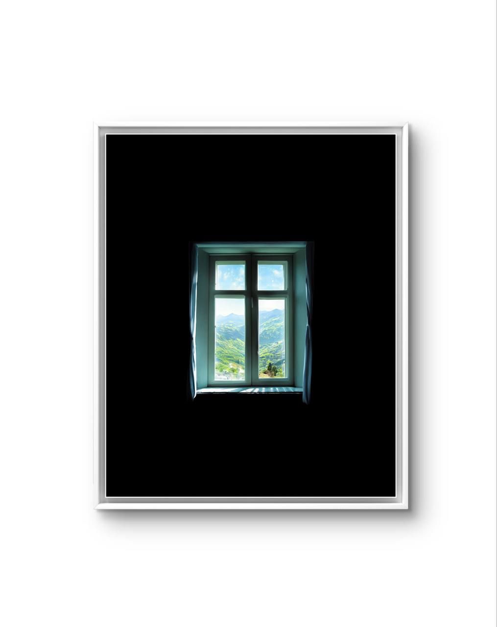
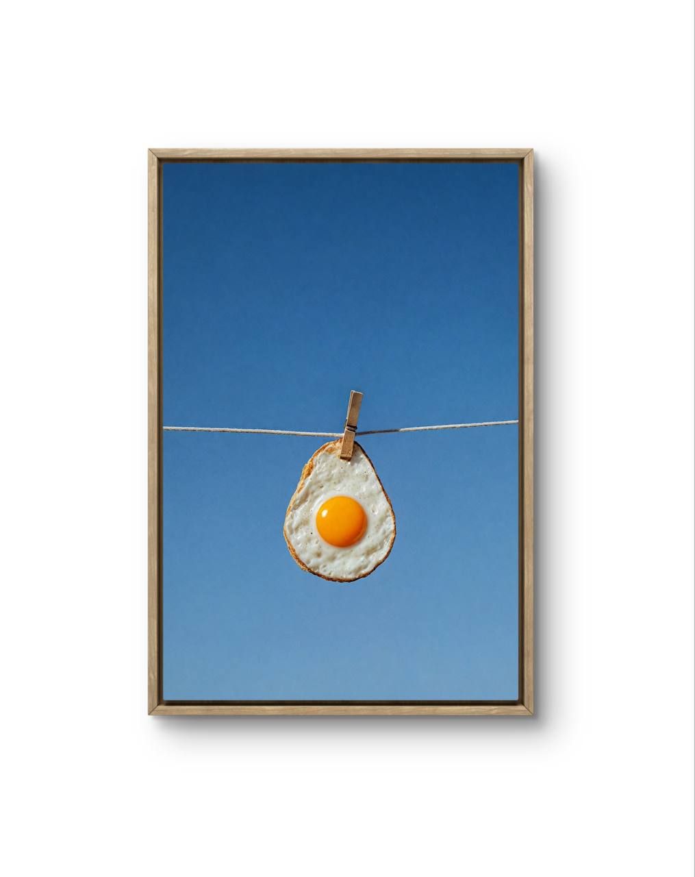
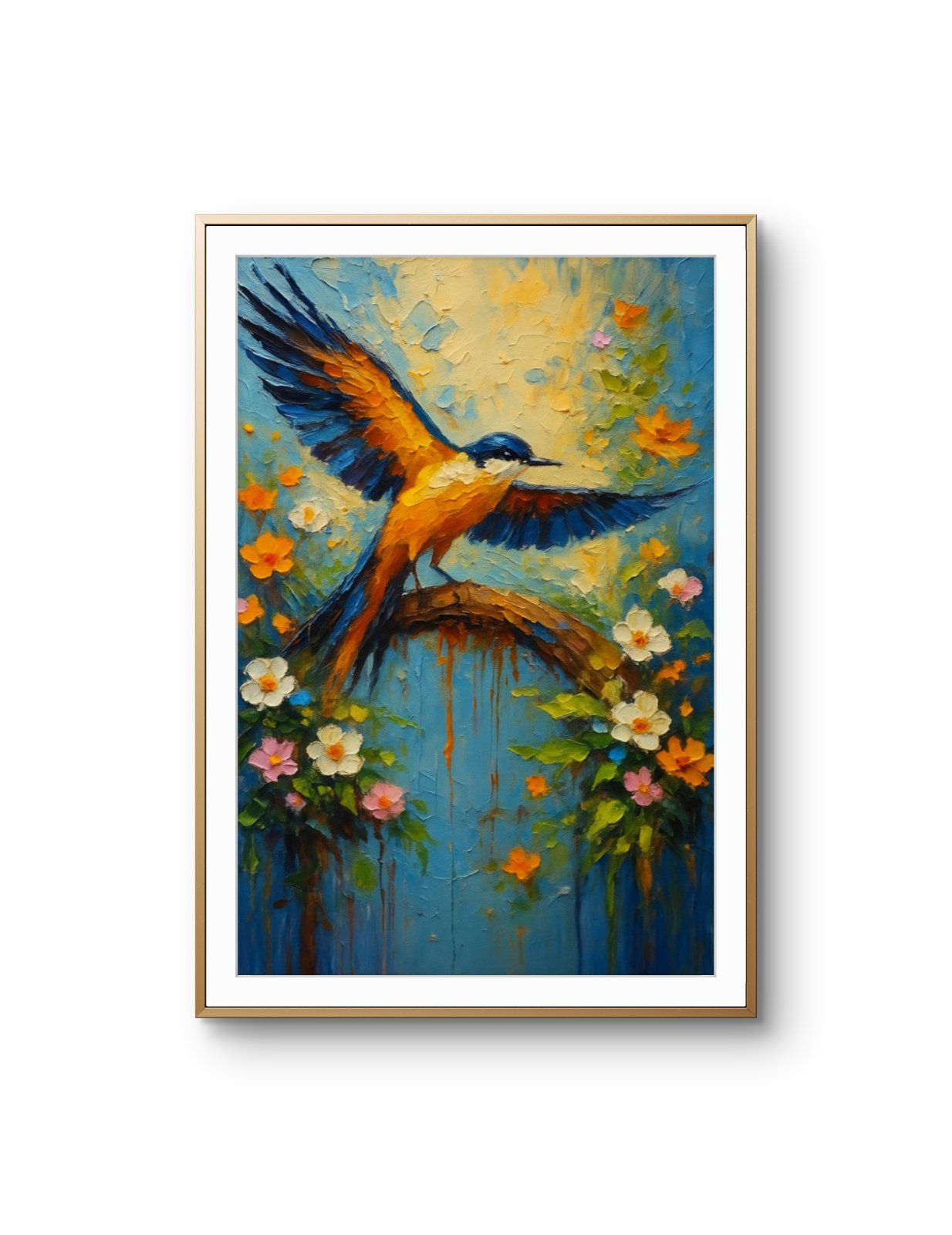
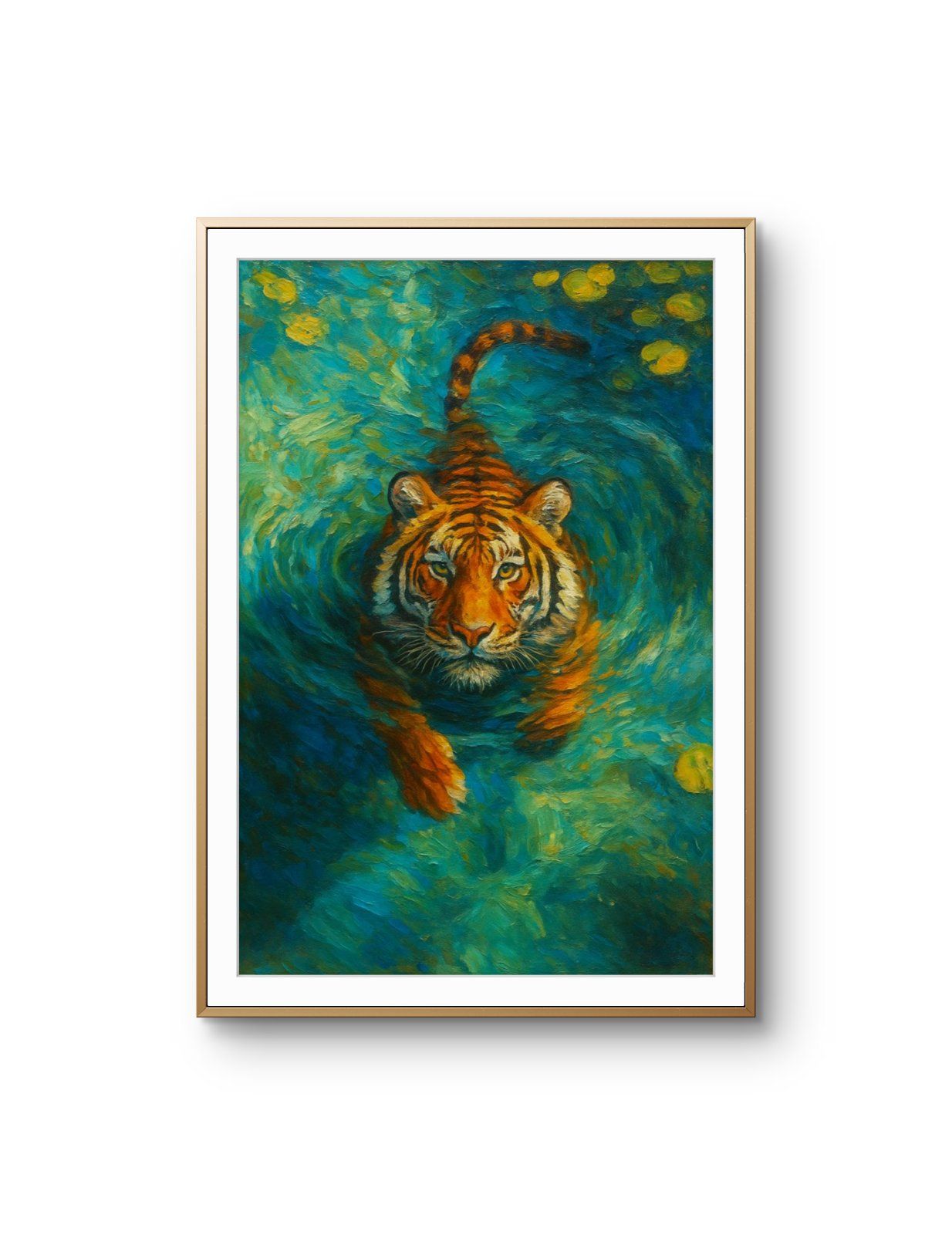
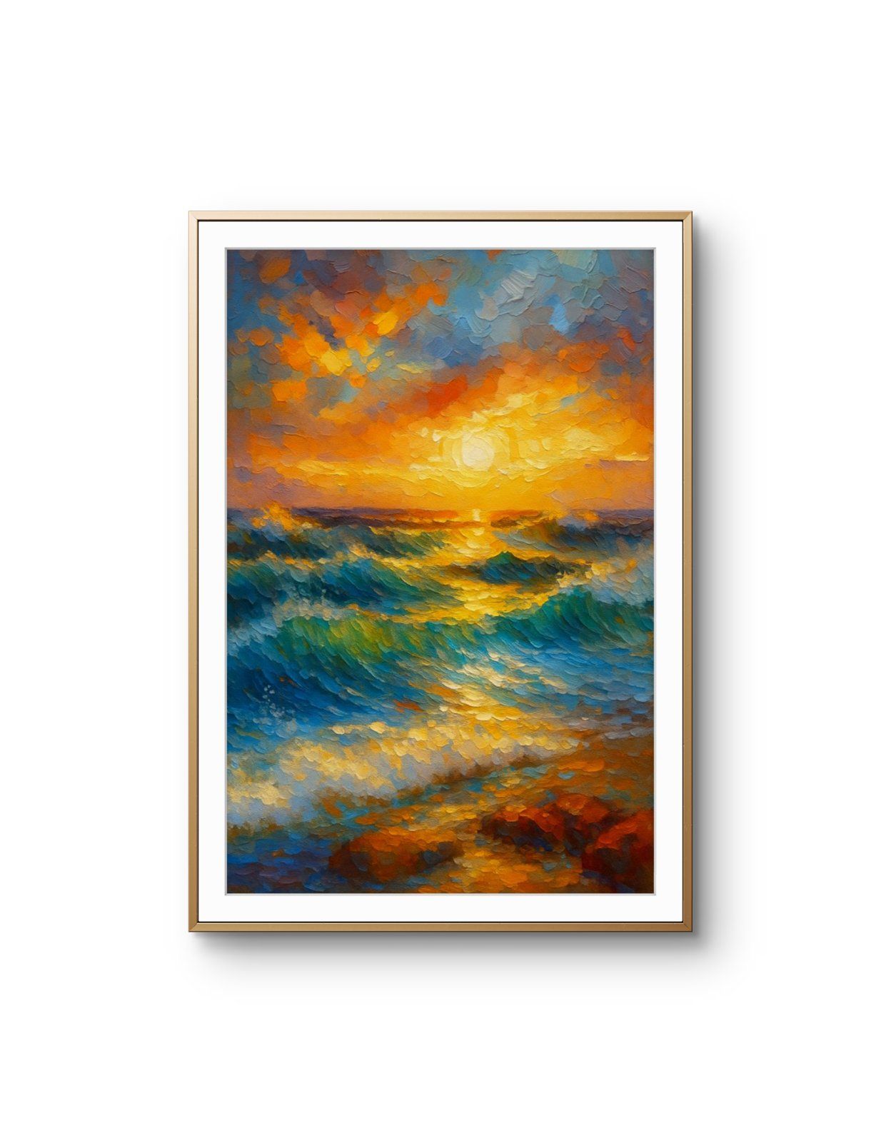
This edit gathers the works where blue does the heavy lifting — open sky, deep water, cold neon and cobalt abstraction. All signed, all shipped unframed.
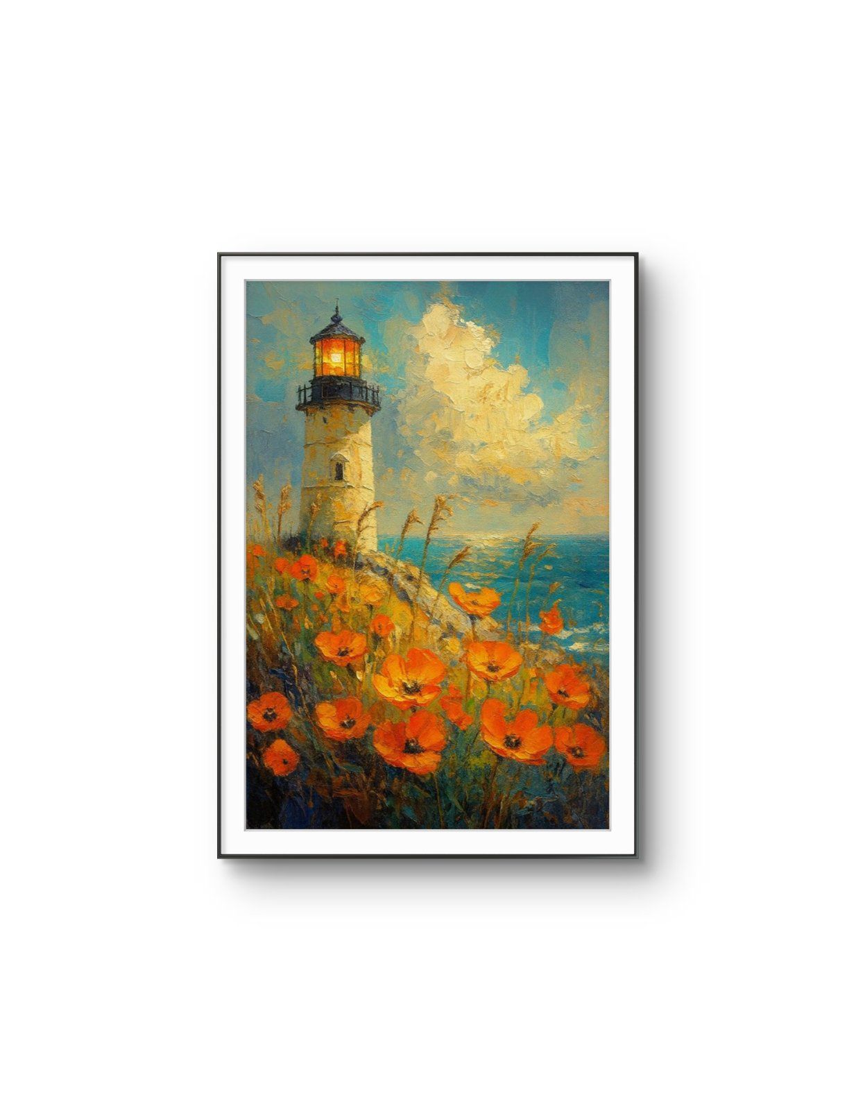
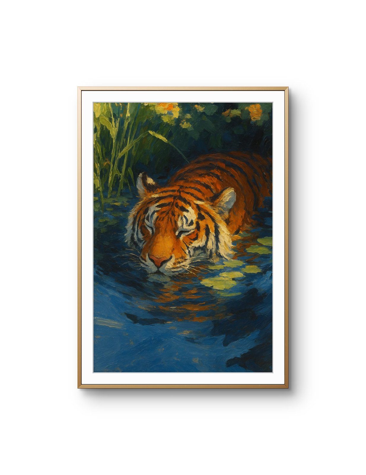
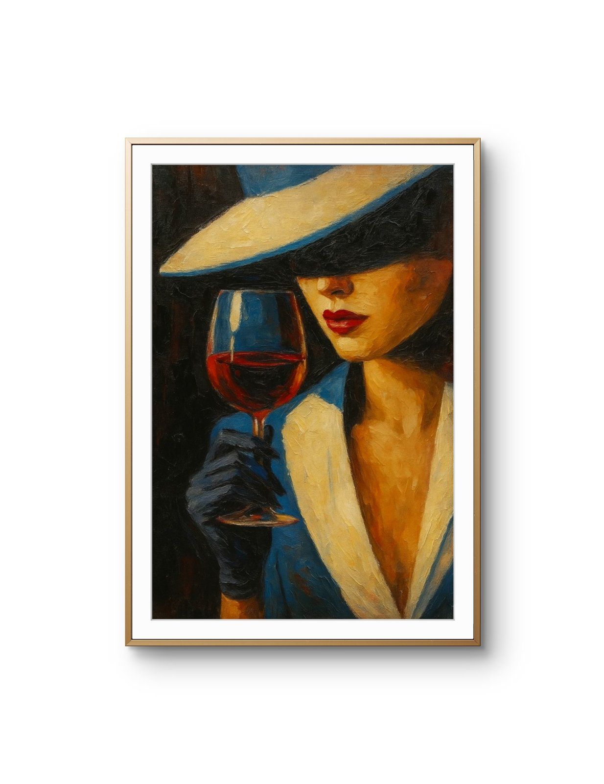
27 works, priced €65–€195, where blue carries the image: open sky, deep water, cold neon and cobalt abstraction. Blue is the one colour that reliably recedes, so it pushes a wall back rather than forward and settles a small room instead of crowding it.
Warm colours advance and cool ones retreat — it is the oldest observation in colour theory and the most useful one when you are buying for a specific wall. A blue-dominant print pushes the wall back rather than pulling it forward, which is why these 27 works make a small room feel larger and a red or ochre print in the same spot makes it feel smaller.
It is also the reason blue is the safe answer in a room you are not sure about. Blue sits against wood, stone, white paint and almost every neutral without needing to be matched to anything.
The edit runs across a wide range: pale open sky, deep water, cold neon and saturated cobalt abstraction. They do not behave alike. Pale blues read as air and need a bright room to work in — in a dim space they go grey and the print looks washed. Deep navy and cobalt do the opposite: they hold their identity under lamplight, which makes them the better choice for a north-facing room or an evening space.
Against warm walls — terracotta, mustard, warm white — blue is a complement and reads as deliberate. Against a cool grey wall it can disappear, so give it a warm wood frame to hold it out from the surface.
Blue tolerates larger formats better than most colours because it does not accumulate visual weight the way a warm dominant does. A large blue print reads as calm; a large red one reads as an event. Sizes in this edit run 40×30 – 60×40 cm.
Every piece here is a limited edition of 25, hand-signed by its artist and shipped unframed and rolled in a protective tube, priced €65–€195.
Cool colours retreat and warm ones advance. A blue-dominant print pushes the wall back rather than pulling it forward, so it makes a small room read as larger — where a red or ochre print in the same position makes it read as smaller. Across these 27 works that effect is consistent regardless of subject.
It depends on the light. Pale blues read as air and need a bright room; in a dim space they go grey and the print looks washed out. Deep navy and cobalt hold their identity under lamplight, which makes them the better choice for a north-facing room or a space used mainly in the evening.
Warm neutrals — terracotta, mustard, warm white, natural plaster. Against a cool grey wall a blue print can disappear into the surface, so if the room is already cool, use a warm wood frame to hold the image forward.
By the colour the artist describes in the work itself, not by a machine reading pixels. That keeps the selection to pieces where blue is a stated feature of the image rather than an incidental patch somewhere in the frame.
Yes. Every work in this edit is a limited edition of 25, hand-signed by the artist who made it, usually on the reverse so the signature does not compete with the image once framed.
Every print is shipped rolled in a protective tube from the Netherlands, dispatched in 1–2 business days. Delivery is €8 within the Netherlands, €18 across the European Union, €30 to the United Kingdom, Switzerland, Norway and Iceland, €55 to the United States, €80 to the Gulf states and €95 to East and Southeast Asia. Orders over €175 ship free within the Netherlands and the European Union.
Yes — you can return an unframed print in original condition within 14 days of delivery for a refund to the original payment method. Prints ship unframed, so as long as it has not been mounted or trimmed it can go back.